
Wednesday, February 25, 2009
2D Goes 3D
A commonly used strategy in contriving a symbol for a business is to find a way to visualize literal components of your name or the services you provide. Think trees and leaves for environmental groups, keys and locks for locksmiths, etc. So if Jack is in fact in a box, why not make the box 3D instead of 2D? Fast food chain Jack in the Box, headquartered in California and with most outlets on the West Coast, is well-known for its cheeseburgers and Americanized ethnic foods. With an already nationally-recognizable mascot, the big-headed Jack, and humorous TV ads, the chain recently decided that Jack's square of a box wasn't realistic enough. The new logo, designed by Duffy & Partners, is much more saavy, sleek, and expensive looking--a big departure from its previous familial, cutesy look. While I definitely like the 3D change, I miss the charm. My other criticisms: What's with logo's obsessions with sneaking in so-called "smiles" into logos recently? Too bad Pepsi took the lead in that race. Why did they separate Jack from "in the box" if it's really one phrase in our culture? The typography below the 3D box looks way too space-aged for me to associate the chain with comfort and stick-to-my-stomach goodness.


Great Color Palettes
Lisa Rupp is a graphic designer and artist based in Arizona who graduated from Utah State University in 2007. Her patterns are ethereal, feminine, and delicate. She shows impeccable variations of color.


High-Protein Design
Understandably, you would not be enthused to be treated like a piece of meat... but have your designs be treated a nice slab of beef? It's the new craze. Weird Clothing recently packaged its Bermuda shorts brand "Human Meat" in styrofoam and plastic wrap with a sticker label. Sydney-based Salad Design created a promotional, fund-raising package for a local zoo for WWF (World Wide Fund for Nature) and the Australian clothing company, Mooks. Styrofoam, is clearly not the most green option for a mass-produced packaging concept, but the red/white marbling of the shorts really works well visually to mimick the fat-laced meat. In conceptually linking live animals to the packaging we see of dead ones, Salad Design's work is provocative and not just one-note. The steak-shaped tag makes it that much more successful. Rather than jumping on the bandwagon, I hope that other designers think twice about whether this sort of packaging would augment the meaning behind their work. If the relationship doesn't fit, the designs will reach their expiration date before they know it.


Monday, February 23, 2009
Tropican't

 Tropicana (a flagship product of PepsiCo) announced today that it would be discontinuing its redesigned packaging that was launched in early January. Thank you design gods! The previous version with classic imagery of the orange and protruding straw will be brought back in March. So why the sudden switcharoo? Was there that much of a backlash against replacing fresh oranges with a picture of a glass of OJ? Did Tropicana finally realize how generic the revised packaging looked? Did the new numbers reflect an inability to differentiate Tropicana's bland packaging from other companies' generic juices? Apparently, Tropicana's most loyal consumers fervently complained to Tropicana about the redesign via email. This is a definite rare occurrence for a company, but I think that Tropicana is moving back in the right direction. It goes to show the extent to which internet access is changing the ways that companies can tap into their core consumers' brains and bring consumers closer to the big honchos.
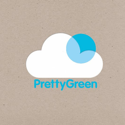
Too Cutesy to Communicate?
London-based Design Friendship's objective was "to create a clean and simple identity for a new brand communication agency. The mark represents the process of bringing light, attention and more importantly life to any client or project Pretty Green will work with." While I love the stylistic direction of the identity, I think it might be too generic of an icon to represent and be easily associated with a brand communications agency. I love the incorporation of transparency, though, in the design.


Take a Crack(er) At It
Design student Meg Gleason designed this Russian-Constructivist-inspired food packaging while studying Graphic Design Methodology at Iowa State. The University describes the course as involving "analysis and application of scientific, systematic, and non-traditional problem-solving and problem-seeking techniques." As you nibble away at the biscuit crackers, you can start deconstructing the package and flatten it (see below) or reconstruct it into an entirely new structure. Overall, it's a great way to think about ways to reuse and display a package, especially in a retail setting. My only gripe is a functionally related: How does the packaging ensure that the biscuits will stay fresh?


Judging Wine by the Label
A hilarious and interactive wine label design that will surely jump off the shelf at buyers. It was designed by Talia Cohen, who graduated in 2008 from Rhode Island School of Design studying Industrial Design.


Sacrifice Design for Ink
In the age of "going green" and making a serious effort on the part of designers to save paper and use recycled materials, it's curious that the design community hasn't given much thought to conserving ink as well. Ecofont is a free font for Macs and PCs that incorporates little white circles within the lines of the letters as the font size is increased, in an effort to help ink cartridges last longer. The Ecofont is based on the Vera Sans, an Open Source letter. The company estimates that Ecofont uses up to 20% less ink than standard fonts off your computer. It's absolutely free, but involved quite the elaborate exploration that led up to its creation: there was extensive testing of all kinds of shapes (the best results were achieved using small circles) to find out how much of a letter could be removed while maintaining readability. Still, I'm not convinced that designers, for which typefaces are sacred territory, will be willing to compromise their designs to save toner.


Wednesday, February 18, 2009
How to Drive Design
Can you get a sense of a car just from an advertisement with solid design and a clear concept -- not even showing the actual car? Peugeot proves it possible with its latest advertisements for the Tepee. These three-dimensional line illustrations contrast the Tepee with car stereotypes like the "bling"ed out SUV, sleek sports car, oversized limo, and the car that can barely fit its driver's big ego. The typography that characterizes the opponents is inspiring, and the use of more realistic wheels contrasts nicely with the drawings. The ads aren't too serious, a nice change compared to "all business" car commercials out there. After all, buying a car might not be quite the party, but driving one sure is. Futura Extra Bold was a nice font choice. The ads were devised by the creative team of creative director Rémi Babinet, art director Raphaël Halin and copywriter Benjamin Sanial. The commercials are even more upbeat and funny.
Links to view the commercials:
Much too much
Bling bling
Moimoimoi


Links to view the commercials:
Much too much
Bling bling
Moimoimoi


Tuesday, February 17, 2009
Delicate Skincare Design
This delicate illustration work was developed for the La Fleur Organique brand of French skincare manufacturer Sanoflore. Archrival, a Nebraskan branding strategy & design firm, created the name, logo, packaging, and website. The line is sold exclusively at Walgreens. This is a fine example of how to effectively keep the style consistent across a line, but still make each product distinct.


Cheers to Illustration
You might be well acquainted with fine men like Jack Daniels or Captain Morgan, but what about the grandparents, parents, and children of the Oggau Family? Well, grab a glass and you can get to know them all too. The Oggau Estate is a new wine growing estate that produces 9 wines. But unlike differentiating their labels by denoting grape varietals, each wine here has its own individual character, its own story, and "complex, changing relationships" ("intrigue, secret affairs, arguments, colorful characters and the odd black sheep"). Jung von Matt designed the logo, original typography, letter paper, wine labels, and a wine box for the Estate. What great illustration work to drink up to!


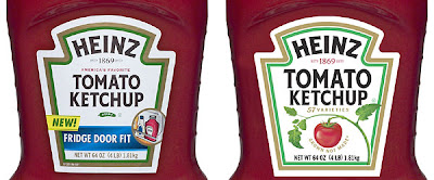
Heinz Seeks Clarity
After over 60 years of keeping its bottle label essentially the same, Heinz recently realized that its label was having an identity crisis. Its new label replaced the pickle underneath "Heinz Tomato Ketchup" with a tomato on the vine and its new tagline: "Grown not made." Why was there a pickle there in the first place? The pickle was the Heinz brand symbol ever since the company's pins were shaped like pickles for its early offerings (sour gherkins and chow chow pickle) at the Chicago World's Fair in 1893. Where will the pickle go? The white top of each bottle. London design firm Vibrant made the colors on the label brighter as well as increasing the size and boldness of the Tomato Ketchup headline. 57 varieties is now on the label also instead of on the bottle's neck. While the design didn't really need an update from a visual standpoint, Heinz pushed forward because the design *did* need an update as far as changing its brand--the perceptions about the company held by the consumers. In today's economy, Heinz needed to reemphasize its quality and pure ingredients, especially facing competition from cheaper store brands and private-label products. The small changes are surely not enough to convince a competitor's loyal customer to switch to Heinz, but they are reflective of how Heinz stays up-to-date with consumer trends and needs and will do its best to keep its customers' loyalty.

Monday, February 16, 2009
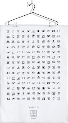
Dry Clean Only
Winning poster from How Magazine's 2009 International Design Awards. The poster is made from actual garment tag fabric (100% cotton) with screen printed ink and can even be washed! It was designed by Vancouver design firm RETHINK (designer/illustrator Kim Ridgewell). The iconography is beautifully executed, and the concept is insightful: laundry tag language is complex and confusing, so leave it to the professionals--aka drycleaners. The fabric poster is meant to hang in a store-front window.
Detail of Dressed in Blue logo:


Detail of Dressed in Blue logo:

More Alice Cho
Here are two other works from Alice Cho, a New York designer and Art Director (last information graphics image below) that I really like. Her travel diary to Brazil features a great variety of layouts and pacing. The typography is consistent yet unpredictable. Beautiful photography and use of color. The last spread is my favorite. Her packaging for her mom's granola definitely looks "wholesome, down to earth, and reminded (me) of home." It's use of white, simple typography, and shape will help it stand out against commercially-designed brands.


Variety of Information Graphics
(1) DesigningTheNews is "a series of visual experiments which explore the news in various ways to encourage new ways of understanding information" and make readers more cognizant of how information is presented and subsequently understood. The Guardian newpaper was used as source material, and some of its headlines were converted into "clear, simple, distinguishable pictograms." The following pictograms were from an article on beer consumption in the UK ("Do we think we've had enough? Beer sales plunge as Britons stay at home."). As a second experiment, photographic textures were added to the outlines to enhance their appeal.

 (2) While not the most aesthetically pleasing charts, here is proof that even the silliest "facts" can be communicated more effectively and efficiently with information graphics.
 (3) Information graphics that are a little more hardcore. Can you imagine how many pages this information would take up if it were prose?! (Alice Cho)
Sunday, February 15, 2009
Branding... a Location
I just recently finished reading Obsessive Branding Disorder by Lucas Conley, where he devotes an entire chapter to describing the lengths to which states and cities will go to alter/create specific perceptions of their respective locations-- the topic is shockingly expansive enough to fill its own book. "Fishington" is a great satire of such branding attempts, designed by Studio On Fire, a design and letterpress workspace in Minneapolis.


Delicious Portraits
Cupcakes are the new pixel. Pastry artist Zilly Rosen from Buffalo constructed side-by-side portraits of Presidents Obama and Lincoln this weekend at the Smithsonian American Art Museum. The portraits were in honor of Lincoln's 200th birthday and used more than 5,600 cupcakes. (vanilla with chocolate buttercream frosting, chocolate with vanilla buttercream frosting, and red velvet for the American flag backdrop). Spectators were allowed to "de-install" (i.e. consume) the cupcake mosaic after waiting for 5 hours. I wouldn't be surprised if a few entrepreneurs brand this technique into a nation-wide business. It could be the new cookie cake craze!


Low Art, High Calorie
What better way to praise your local greasy spoon than design a book around it! Designer Siaron Hughes recently designed a new book Chicken: Low Art, High Calorie to "celebrate the varied and visual qualities of fast food signage, and the people involved." From publisher Mark Batty: "Throughout the world major fast-food chains are easily recognizable, synonymous, for better or worse, with an American way of life. Far more interesting, however, are the generic fast-food establishments that serve menus that are more or less the same, but not as slicked with corporate marketing. A sub-genre of such eateries, found across the United Kingdom and urban America, is the chicken joint." It's incredibly interesting how the gaudy signs with horrible typography are so commonplace, and that when they're laid out in a book by someone with an impeccable eye for design, we read it as clear praise for earnest, vernacular design. At $24.95 per copy, it's an upscale version of the dollar menu that's worth the calories.
Cover:

Excerpts from inside:


Now That's a Well-Designed Beer
Beer accompanied by a label design that just echoes "well-crafted" and "masculine," accompanied by entertaining and well-executed illustrations. Not all beers can look that tasty, even when back lit. It was designed by a London-based firm, Stranger & Stranger. The firm specializes in making the outsides of alcoholic bottles stand out as much as what's on the inside-- a respectable job.


Tuesday, February 10, 2009
A Punny Invitation
The San Francisco Museum of Modern Art recently started holding a biennial fundraiser "to raise critical funds for the museum's exhibitions and education programs." Design firm Elixir's identity for "The Modern Ball" is fun, differentiable, and is a style that allows for small updates to be made each year to the flyer design inside the ball. It's a great example of how packaging can make or break a design.


Saturday, February 7, 2009
Redesign... Because Everyone Else Is
Futura Extra Bold set in all caps is not exactly the best way to freshen up your look... especially if you already have a fun logo working for you! Blimpie's old logo full of personality, arguably moreso than Subway, and significantly more lively and appealing than this new dull green one. Yes, I associate it with the vegetation that will likely show up in my sandwich. Check plus there. But we all know that lettuce isn't the heart of a well-made sandwich. The new logo needs some more ingredients to make it work.

The competition:
The competition:
Subscribe to:
Posts (Atom)