
Wednesday, February 25, 2009
2D Goes 3D
A commonly used strategy in contriving a symbol for a business is to find a way to visualize literal components of your name or the services you provide. Think trees and leaves for environmental groups, keys and locks for locksmiths, etc. So if Jack is in fact in a box, why not make the box 3D instead of 2D? Fast food chain Jack in the Box, headquartered in California and with most outlets on the West Coast, is well-known for its cheeseburgers and Americanized ethnic foods. With an already nationally-recognizable mascot, the big-headed Jack, and humorous TV ads, the chain recently decided that Jack's square of a box wasn't realistic enough. The new logo, designed by Duffy & Partners, is much more saavy, sleek, and expensive looking--a big departure from its previous familial, cutesy look. While I definitely like the 3D change, I miss the charm. My other criticisms: What's with logo's obsessions with sneaking in so-called "smiles" into logos recently? Too bad Pepsi took the lead in that race. Why did they separate Jack from "in the box" if it's really one phrase in our culture? The typography below the 3D box looks way too space-aged for me to associate the chain with comfort and stick-to-my-stomach goodness.


Great Color Palettes
Lisa Rupp is a graphic designer and artist based in Arizona who graduated from Utah State University in 2007. Her patterns are ethereal, feminine, and delicate. She shows impeccable variations of color.


High-Protein Design
Understandably, you would not be enthused to be treated like a piece of meat... but have your designs be treated a nice slab of beef? It's the new craze. Weird Clothing recently packaged its Bermuda shorts brand "Human Meat" in styrofoam and plastic wrap with a sticker label. Sydney-based Salad Design created a promotional, fund-raising package for a local zoo for WWF (World Wide Fund for Nature) and the Australian clothing company, Mooks. Styrofoam, is clearly not the most green option for a mass-produced packaging concept, but the red/white marbling of the shorts really works well visually to mimick the fat-laced meat. In conceptually linking live animals to the packaging we see of dead ones, Salad Design's work is provocative and not just one-note. The steak-shaped tag makes it that much more successful. Rather than jumping on the bandwagon, I hope that other designers think twice about whether this sort of packaging would augment the meaning behind their work. If the relationship doesn't fit, the designs will reach their expiration date before they know it.


Monday, February 23, 2009
Tropican't

 Tropicana (a flagship product of PepsiCo) announced today that it would be discontinuing its redesigned packaging that was launched in early January. Thank you design gods! The previous version with classic imagery of the orange and protruding straw will be brought back in March. So why the sudden switcharoo? Was there that much of a backlash against replacing fresh oranges with a picture of a glass of OJ? Did Tropicana finally realize how generic the revised packaging looked? Did the new numbers reflect an inability to differentiate Tropicana's bland packaging from other companies' generic juices? Apparently, Tropicana's most loyal consumers fervently complained to Tropicana about the redesign via email. This is a definite rare occurrence for a company, but I think that Tropicana is moving back in the right direction. It goes to show the extent to which internet access is changing the ways that companies can tap into their core consumers' brains and bring consumers closer to the big honchos.
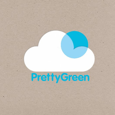
Too Cutesy to Communicate?
London-based Design Friendship's objective was "to create a clean and simple identity for a new brand communication agency. The mark represents the process of bringing light, attention and more importantly life to any client or project Pretty Green will work with." While I love the stylistic direction of the identity, I think it might be too generic of an icon to represent and be easily associated with a brand communications agency. I love the incorporation of transparency, though, in the design.


Take a Crack(er) At It
Design student Meg Gleason designed this Russian-Constructivist-inspired food packaging while studying Graphic Design Methodology at Iowa State. The University describes the course as involving "analysis and application of scientific, systematic, and non-traditional problem-solving and problem-seeking techniques." As you nibble away at the biscuit crackers, you can start deconstructing the package and flatten it (see below) or reconstruct it into an entirely new structure. Overall, it's a great way to think about ways to reuse and display a package, especially in a retail setting. My only gripe is a functionally related: How does the packaging ensure that the biscuits will stay fresh?


Judging Wine by the Label
A hilarious and interactive wine label design that will surely jump off the shelf at buyers. It was designed by Talia Cohen, who graduated in 2008 from Rhode Island School of Design studying Industrial Design.


Subscribe to:
Posts (Atom)