New Wal-Mart Logo
Wal-Mart just (unofficially, according to the Wall Street Journal) announced the introduction of a fresh and new logo for its Wal-Mart stores. The featured logo is no longer in uppercase and is set in a lighter blue in what appears as a friendlier san serif (instead of one that echoes the corporate machine that Wal-Mart epitomizes). What is most noticeable is that Wal-Mart has chosen to replace its iconic star with a “star burst.” It’s unclear what the burst actually stands for -- perhaps something to do with energy, technology, or nature and the environment. It’s most likely an attempt to humanize the company, but can a burst like this one evolve into as iconic of an image as Target’s red target? And what exactly is going to be changing inside the Wal-Mart stores that this new logo is supposed to reflect? How is Wal-Mart really going to make us “live better”?

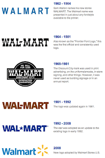
This timeline shows how dull and ugly Wal-Mart's logos really have been over the years.

1 comment:
The new one looks like a bank logo.
Post a Comment