UPenn Fine Arts Senior Thesis Blog

Wednesday, July 30, 2008

Louise Bourgeois

This past weekend I checked out the Louise Bourgeois exhibit at the Guggenheim. Some of her work was really breathtaking. It was incredibly apparent how personal each piece on display was to the artist. In most of her pieces, she plays with the relation of the person to the group, a hard and soft duality, and a juxtaposition of elements of male and female anatomy. For example, pieces that suggest organic subjects may not only be interpreted as either phalluses or breasts, but may also be shown in a contrasting hard material like marble or bronze. Form-wise, I found Arch of Hysteria from 1993 her most intriguing piece. Made from bronze, the headless arched sculpture floats midair from the ceiling. It seems graceful but there is a tension in the straining of the body’s muscles. Its interest lies in its interaction with the viewer – it is a confrontational piece and the limbs provide an entirely different view depending on where the viewer is standing. Conceptually, I thought that Bourgeois’ “cells” were her strongest pieces. The Guggenheim exhibition guide describes these works as “a series of haunting, roomlike spaces, in a manifestation of the architectural imagery that pervades her earliest work. Bourgeois refers to these installations as Cells, a term that invites associations with incarceration and monastic contemplation, as well as the most basic element of the human body. Combining sculptural works with found objects she amassed throughout her life, these complex assemblages are vessels for potent psychological narratives, revealing with unprecedented emotional intensity the artist’s attempt to confront and transmute her own history.” The cells are shaped by multiple scrap wood doors (sort of like a fort) with personal memorabilia or metaphoric objects hidden (protected) inside. While all of Bourgeois’ work is extremely personal, I found it odd that some cells were completely closed off from the viewer. Some doors even coincidentally had “private” in transfer lettering on the opaque window. Bourgeois is always in control of her work, though. She purposefully orients the doors to keep the viewer from taking in all of the work/all of her private childhood memories. This parallels the idea that the door itself is something that can invite someone in or close someone off.

Tuesday, July 29, 2008

Objectified

I just received word via a Helvetica Film News email alert of a new film coming out directed by Gary Hustwit (director of Helvetica in 2006). Objectified is a documentary about industrial design – “the manufactured objects we surround ourselves with, and the people who make them.” I think this an incredibly interesting follow-up to his tracking of the overwhelming usage of Helvetica all over the world. It is also a cool way to delve into everyday design, as AIGA has also done with its current exhibit (which I will finally have a chance to check out and blog about later this week). Hustwit writes: “I’m interested in industrial designers because their work influences so many aspects of our world yet most of the time it’s taken for granted. And I think that, especially today, it’s crucial for us to re-examine how we make and use consumer products at every level… The term objectified has two meanings. One is ‘to be treated with the status of a mere object.’ But the other is ‘something abstract expressed in a concrete form,’ as in the way a sculpture objectifies an artist’s thoughts. It’s the act of transforming creative thought into a tangible object, which is what designers in this film do every day. But maybe there’s a third meaning to this title, regarding the ways these objects are affecting us and our environment. Have we all become objectified?” Hustwit’s analysis actually connects to the use of the movie logo on a t-shirt, which all of a sudden makes the t-shirt take on a new meaning for the wearer. I absolutely love the logo for this movie (designed by British graphic designer Michael C. Place of Build). It is clearly strong conceptually and its iconic design actually reminds me of one of the design proposals from my Advanced Graphic Design class for exterior signage for Charles Addams Fine Arts Hall last fall. All in all, I’m curious what the movie will have to say about the few objects that got it right the first time—the objects, unlike the toothbrush, whose designs have not been altered since their inception—like that of the paperclip. The movie is supposed to premiere in early 2009 and the Objectified website will be blogging about the film and feature photos from shoots and video excerpts in the meantime so check it out: http://www.objectifiedfilm.com. Also, there are posters and t-shirts available with the movie logo, but be ready to empty our your pockets to get your hands on one.

Thursday, July 24, 2008

My First Press Check

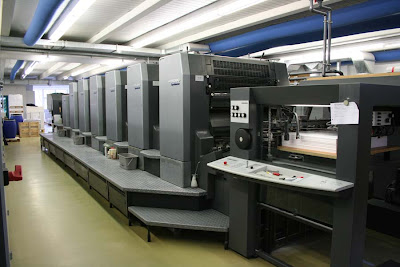
Last week, I went on my first press check for work. The press was in Englewood, New Jersey (not that far from Manhattan). Some of the houses there are gorgeous... Aside from that, it was really cool to see the entire process from how a file is prepped and then printed out on a metallic plate that then goes onto a HUGE press. The paper feeds through the press, gets inked and then little tweaks are made (some by hand, others electronically) to make sure that the registration and coloring looks as best as it can. The whole experience made me really embrace the fact that good design on its own is only half the “battle.” If the paper choice is poor, or the coloring is off, or the printer does a crappy job, good design cannot nearly compensate for these types of errors. While the graphic design curriculum at Penn does emphasize the importance of handcraft, paper choice, and printing in making our final products, I don’t think that our eyes have been opened up enough to the commercial aspect of printing, which if we pursue the field of design, we will inevitably work closely with.

Obauhaus for your momma?

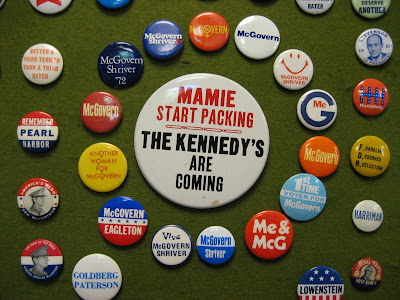
It has become increasingly clear to me that the 2008 Presidential Elections are not just about the issues our country faces/will face in the upcoming years and which candidate we can see helping move our nation forward, but about (dare I suggest) graphic design. In previous elections of the twentieth century, wearing campaign buttons was largely popular during election season. Some of these buttons, as I found in my house’s basement in my dad’s collection, have hideous designs. There is absolutely no consistency in the use of typefaces or color or styles from button to button for the same candidate. Would this really fly today? Probably not, and I give Obama’s campaign significant credit for understanding this.

Regardless of where you stand on the political spectrum, I have to say that Obama is kicking McCain’s ass as far as campaign design goes. If his nontraditional typeface choice (Gotham) and logo illustration isn’t enough to win the argument, here is the latest evidence: For an address that Obama was scheduled to make today in Berlin, Germany, his campaign produced a poster (left) that directly mimics Bauhaus design (right - one of the most important design movements in the twentieth century that took place in Germany in the 1920s/1930s).

Here is a bit more about Bauhaus design:

San-serif types and strong horizontal and vertical rules were typical of Bauhaus style design, but were part of a much more radical reform which examined the elements of graphic design and the role each played in the transmitting of information. At the Bauhaus, a basic education in the mechanics of visual communication began with the study of letterforms and typographic layout. The Bauhaus set forth elementary principles of typographic communication, which were the beginnings a style termed "The New Typography” that started with:
1. Typography is shaped by functional requirements.
2. The aim of typographic layout is communication (for which it is the graphic medium). Communication must appear in the shortest, simplest, most penetrating form.
3. For typography to serve social ends, its ingredients need internal organization - (ordered content) as well as external organization (the typographic material properly related).

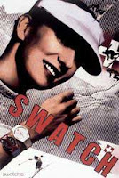
Obama’s poster for Berlin shows the same bold diagonals and san serif that was used in typical Bauhaus designs. While Obama’s poster is more a simulacrum of Bauhaus design (an imitation where the original does not exist), it does remind me of Paula Scher’s Swatch poster (right), which she designed after Herbert Matter’s Swiss Tourist Posters (left and center). Obama’s poster goes to show that even in design and politics, the more things change—the more they remain the same.

About Bauhaus design: http://web.utk.edu/~art/faculty/kennedy/bauhaus/bauhaus.html
About Herbert Matter: http://www.designhistory.org/posters.html

Tuesday, July 15, 2008

Keep Your Laptops Packed

Newly designed carry-on bags can pass through security at airports without having to take out laptops for the X-ray as soon as the bags come on the market, says the Transportation Security Administration. These new bags are supposed to be available by late September or early October. “The new cases include either a fold-down section in a bigger briefcase or a stand-alone protective sleeve that contains no extra clutter and can be readily viewed through the scanner,” the New York Times said. While price is obviously going to be a factor in whether laptop owners go out and buy these new cases, there are a couple of other important factors in their success: are you a frequent traveler? Do you already have a laptop case that you are happy with? Would you use this new laptop case just for when you travel? What is the design of the case? Is it missing features that are important to you? And what kind of advertising campaigns are these companies going to create to announce the launch of these new cases? Will it focus exclusively on the emotional or rational benefits of the product? Is there a limit to how much hype an ad campaign can stir over just a laptop case?


Here is the NY Times article with the details... except it doesn't include pictures of what the cases are expected to look like.

Declining Yearbook Sales

In last week’s issue of The Economist (July 5th-11th), there was an interesting short article regarding the recent decline in the purchase and production of printed yearbooks. With the increasing cost of print-runs, the overwhelming popularity of social networking sites, and the replacement of print with electronic media, I find this no surprise. Why pay $75 to remember your college days in just one book when you can treasure the memories online and keep in touch with your classmates over Facebook and MySpace? According to the article, Purdue University and DePauw University, both in Indiana, have recently stopped the presses on printed yearbooks, and many colleges are beginning to try to use new media to replace the print, including DVDs to summarize the year. It should be interesting to see whether this trend extends to high school, where claiming to be part of the yearbook staff had an impressive air. Even if schools begin to switch to new media like DVDs to summarize the year, will it serve as a fair replacement for printed yearbooks? Will more students be more likely to buy these? How much are students and universities willing to pay to see their memories (or snapshots) in print?

Wednesday, July 9, 2008

Obama, Gotham, and... Lingerie?

One of my friends found this on a blog of Robert Kelley, a writer and management consultant based in New York City, and I wanted to share. Turns out Obama's "Change" slogan is also the name of a Danish underwear brand whose logo looks almost exactly the same as Obama's signage (see www.change.com). The underwear brand's type is slightly different -- Kelley points out that the ends of the "C" are vertical, the inside hook of the 'G' is slightly smaller, and the tips of the 'E' are of different lengths." Is this really just a coincidence? If not, can you blame whoever designed the slogan that has stood at the forefront of Obama's campaign for being "inspired"?

Recyclable AND Fashionable

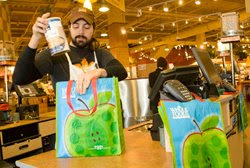
In Union Square, there are 3 grocery stores within a few steps of each other. But today it’s not so much about what you buy or where you shop for food, but what you carry your groceries home in. “Paper or plastic?” is no longer as popular of a question as “credit or debit?” when you’re standing at the register. It is clear why the abundance of paper and plastic bags distributed to shoppers is extremely wasteful and can’t possibly be helping our environment.

Whole Foods Market advertises its “Better Bag,” made from recycled plastic bottles, for only 99 cents and otherwise provides 100% recycled and recyclable paper bags (with tips for other uses for the bags once you get home). Also, Whole Foods Market is providing refunds of at least 5 cents for each reusable bag that a customer provides. Whole Foods claims: “Plastic bags are petroleum based and they fill landfills, harm nature and litter our communities. Since it can take more than 1,000 years for a plastic bag to break down in a landfill, polymers of every single plastic bag ever produced still exist on our planet. As they break down, plastic bags go through photodegradation—breaking down into small toxic particles that contaminate both soil and water, and end up entering the food chain when animals accidentally ingest them. It takes roughly 430,000 gallons of crude oil to produce 100 million plastic bags, and in the U.S. alone, about 100 billion

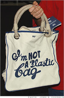
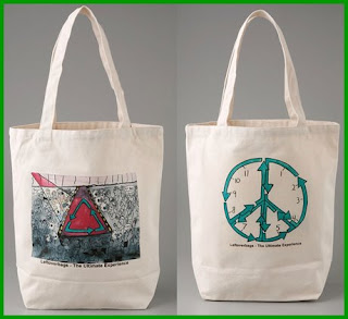
Whole Foods Market’s effort sounds great, but “Going Green” in New York can end up being more about making a fashion statement and making big bucks off of trend than saving resources. I can’t help but think that many shoppers are carrying reusable totes for their shopping excursions more because they want to be seen supporting the cause than because they legitimately believe in it. Last year, Whole Foods also introduced a limited edition bag designed by “handbag guru Anya Hindmarsh” that read “I’m not a plastic bag” to help raise environmental awareness. They only cost $15 each and people lined up to buy them. How much are New Yorkers willing to pay to look fashionable and green at the same time? The company Leftover Bags designs organic-cotton bags that “feature a graphic that can define your style.” They retail for $38. Even Juicy Couture has hopped on the bandwagon with its “Go Green Icon Tote” for $75. Now that’s a lot of green to drop to “Go Green.”

Saturday, July 5, 2008

Got Milk?

Solution, or Mess? A Milk Jug for a Green Earth

Published in the NYT on June 30, 2008

NORTH CANTON, Ohio — A simple change to the design of the gallon milk jug, adopted by Wal-Mart and Costco, seems made for the times. The jugs are cheaper to ship and better for the environment, the milk is fresher when it arrives in stores, and it costs less.

What’s not to like? Plenty, as it turns out.

The jugs have no real spout, and their unorthodox shape makes consumers feel like novices at the simple task of pouring a glass of milk.
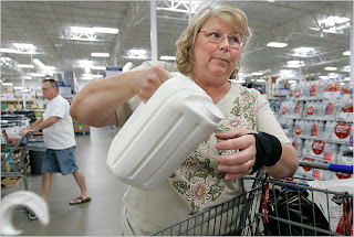
“I hate it,” said Lisa DeHoff, a cafe owner shopping in a Sam’s Club here.

“It spills everywhere,” said Amy Wise, a homemaker.

“It’s very hard for kids to pour,” said Lee Morris, who was shopping for her grandchildren.

But retailers are undeterred by the prospect of upended bowls of Cheerios. The new jugs have many advantages from their point of view, and Sam’s Club intends to roll them out broadly, making them more prevalent.

The redesign of the gallon milk jug, experts say, is an example of the changes likely to play out in the American economy over the next two decades. In an era of soaring global demand and higher costs for energy and materials, virtually every aspect of the economy needs to be re-examined, they say, and many products must be redesigned for greater efficiency.

“This is a key strategy as a path forward,” said Anne Johnson, the director of the Sustainable Packaging Coalition, a project of the nonprofit group GreenBlue. “Re-examining, ‘What are the materials we are using? How are we using them? And where do they go ultimately?’ ”

Wal-Mart Stores is already moving down this path. But if the milk jug is any indication, some of the changes will take getting used to on the part of consumers. Many spill milk when first using the new jugs.

“When we brought in the new milk, we were asking for feedback,” said Heather Mayo, vice president for merchandising at Sam’s Club, a division of Wal-Mart. “And they’re saying, ‘Why’s it in a square jug? Why’s it different? I want the same milk. What happened to my old milk?’ ”

Mary Tilton tried to educate the public a few days ago as she stood at a Sam’s Club in North Canton, about 50 miles south of Cleveland, luring shoppers with chocolate chip cookies and milk as she showed them how to pour from the new jugs.

“Just tilt it slowly and pour slowly,” Ms. Tilton said to passing customers as she talked about the jugs’ environmental benefits and cost savings. Instead of picking up the jug, as most people tend to do, she kept it on a table and gently tipped it toward a cup.

Mike Compston, who owns a dairy in Yerington, Nev., described the pouring technique in a telephone interview as a “rock-and-pour instead of a lift-and-tip.”

Demonstrations are but one of several ways Sam’s Club is advocating the containers. Signs in the aisle laud their cost savings and “better fridge fit.”

And some customers have become converts.

“With the new refrigerators with the shelf in the door, these fit nice,” said April Buchanan, who was shopping at the Sam’s Club here. Others, even those who rue the day their tried-and-true jugs were replaced, praised the lower cost, from $2.18 to $2.58 a gallon. Sam’s Club said that was a savings of 10 to 20 cents a gallon compared with old jugs.

The new jug marks a sharp break with the way dairies and grocers have traditionally produced and stocked milk.

Early one recent morning, the creators and producers of the new tall rectangular jugs donned goggles and white coats to walk the noisy, chilly production lines at Superior Dairy in Canton, Ohio. It was founded in 1922 by a man who was forced to abandon the brandy business during Prohibition. Five generations of the founder’s family, the Soehnlens, have worked there.

Today, they bottle and ship two different ways. The old way is inefficient and labor-intensive, according to members of the family. The other day, a worker named Dennis Sickafoose was using a long hook to drag plastic crates loaded with jugs of milk onto a conveyor belt.

The crates are necessary because the shape of old-fashioned milk jugs prohibits stacking them atop one another. The crates take up a lot of room, they are unwieldy to move, and extra space must be left in delivery trucks to take empty ones back from stores to the dairy.

They also can be filthy. “Birds roost on them,” said Dan Soehnlen, president of Superior Dairy, which spun off a unit called Creative Edge to design and license new packaging of many kinds. He spoke while standing in pools of the soapy run-off from milk crates that had just been washed. About 100,000 gallons of water a day are used at his dairy clean the crates, Mr. Soehnlen said.

But with the new jugs, the milk crates are gone. Instead, a machine stacks the jugs, with cardboard sheets between layers. Then the entire pallet, four layers high, is shrink-wrapped and moved with a forklift.

The company estimates this kind of shipping has cut labor by half and water use by 60 to 70 percent. More gallons fit on a truck and in Sam’s Club coolers, and no empty crates need to be picked up, reducing trips to each Sam’s Club store to two a week, from five — a big fuel savings. Also, Sam’s Club can now store 224 gallons of milk in its coolers, in the same space that used to hold 80.

The whole operation is so much more efficient that milk coming out of a cow in the morning winds up at a Sam’s Club store by that afternoon, compared with several hours later or the next morning by the old method. “That’s our idea of fresh milk,” Greg Soehnlen, a vice president at Creative Edge, said.

Sam’s Club started using the boxy jugs in November, and they are now in 189 stores scattered around the country. They will appear soon in more Sam’s Club stores and perhaps in Wal-Marts.

The question now is whether customers will go along.

As Ms. Tilton gave her in-store demonstration the other day at the Sam’s Club here, customers stood around her, munching cookies and sipping milk. “Would you like to take some home today?” she asked.

A shopper named Jodi Kauffman gave the alien jugs a sidelong glance.

“Maybe,” she said.

New Wal-Mart Logo

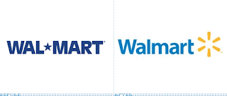
Wal-Mart just (unofficially, according to the Wall Street Journal) announced the introduction of a fresh and new logo for its Wal-Mart stores. The featured logo is no longer in uppercase and is set in a lighter blue in what appears as a friendlier san serif (instead of one that echoes the corporate machine that Wal-Mart epitomizes). What is most noticeable is that Wal-Mart has chosen to replace its iconic star with a “star burst.” It’s unclear what the burst actually stands for -- perhaps something to do with energy, technology, or nature and the environment. It’s most likely an attempt to humanize the company, but can a burst like this one evolve into as iconic of an image as Target’s red target? And what exactly is going to be changing inside the Wal-Mart stores that this new logo is supposed to reflect? How is Wal-Mart really going to make us “live better”?

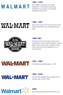
This timeline shows how dull and ugly Wal-Mart's logos really have been over the years.

Blog Archive